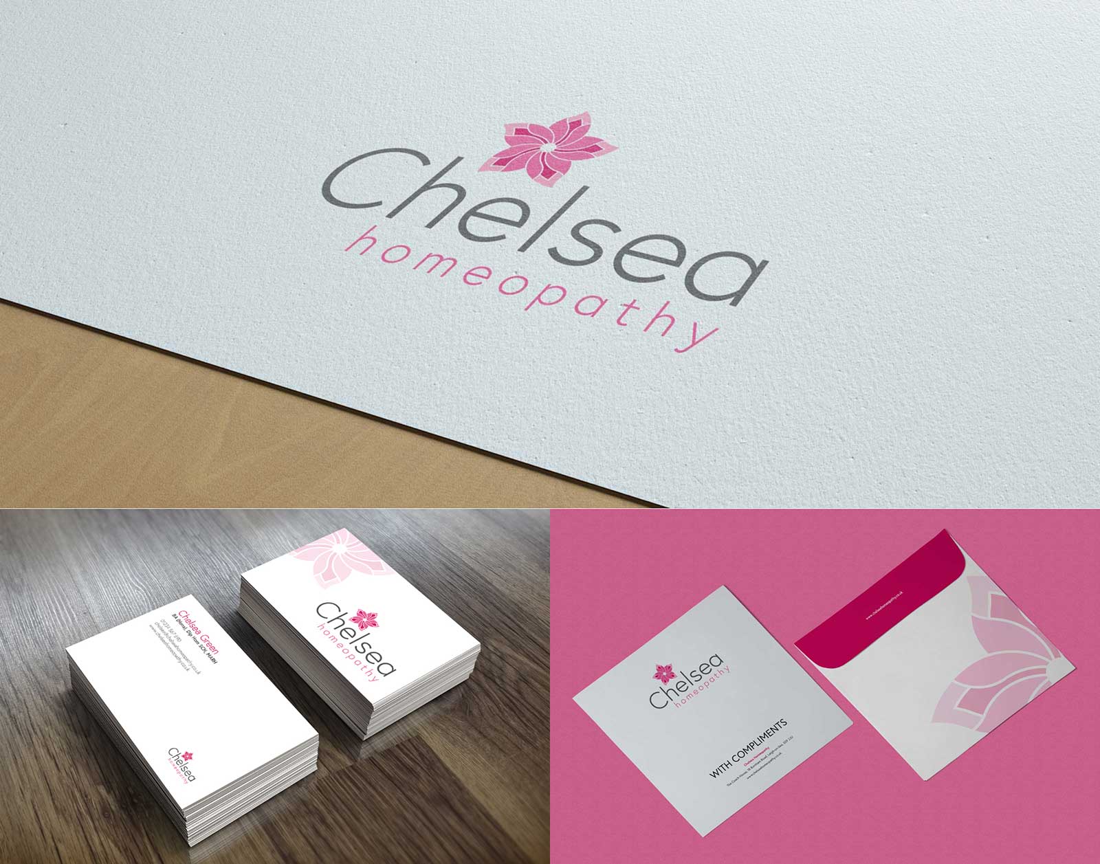
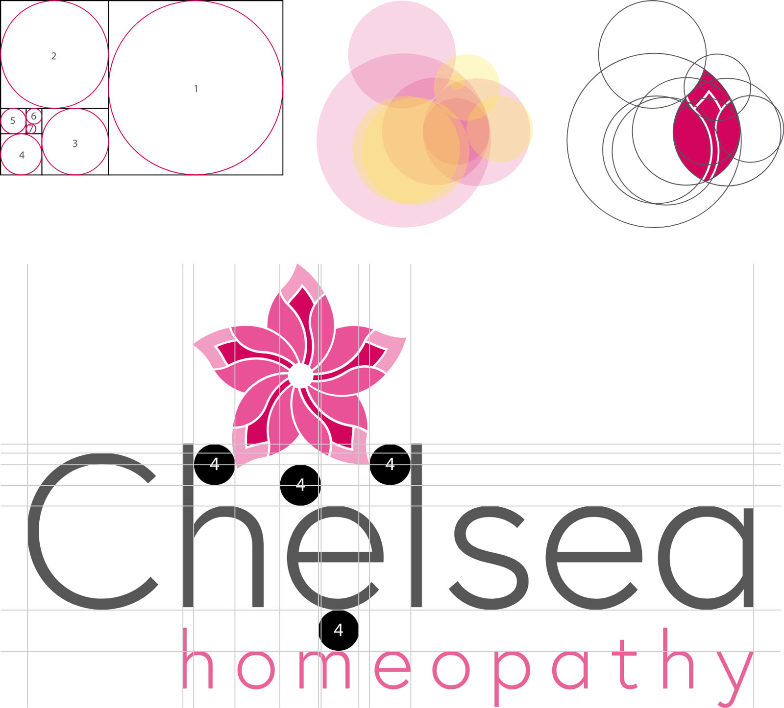
Chelsea is a well known and highly qualified professional homeopath based in Leigh on Sea in Essex. She first approached Atom Creative Media to help her to rebrand her business, as she felt that the existing logo was looking a little dated. However, since there were elements of the original design that she – and her clients – continued to enjoy, it was important to Chelsea that the core look and feel of the overall brand remained largely intact.
![]()
This project was all about bringing Chelsea’s brand forward into a more contemporary space, as well as infusing some positive emotional context and meaning to it.
The Brief
During our first meeting, Chelsea told us how much she loves Japanese and Scandinavian design styles and principles – specifically in the natural beauty that can be found in simplicity and minimalism. This gave us a solid starting point to begin our research.
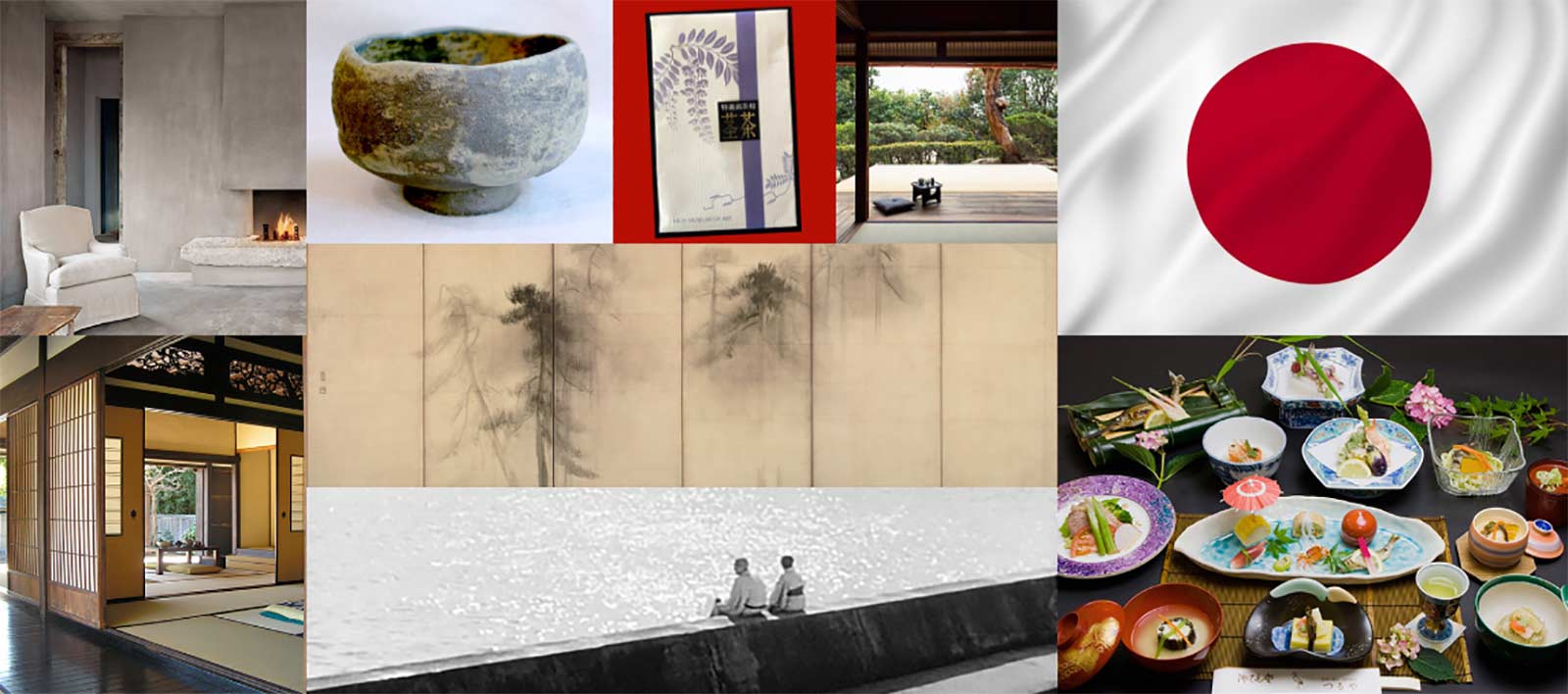
Japanese Design
Researching this area was one of the most fun and interesting parts of the project. We learned of the principles of ma, which represents void space. Within this void space we are gifted the opportunity to contemplate and to reflect – to be comfortable with silence, and thankful for a moment of peace. If you look for it, ma can be seen everywhere – even in the Japanese flag itself; the central red circle (representing the sun) is surrounded by this contemplative void space.
We also learned of sabi, which represents the beauty that can be found in asymmetry, imperfection and randomness. Sabi allows us to be surprised, and take delight in unpredictability. We created a mood board to help keep the ideals and objectives of the design direction on track.